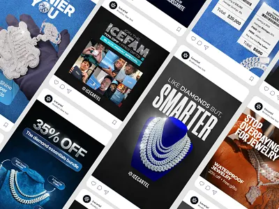
There was a time when “more” felt like the answer to everything in advertising. More colors. More animations. More fonts. More cleverness packed into a single frame. Somewhere along the way, design stopped supporting the message and started competing with it. That’s where many brands are quietly losing attention today i.e. through over-designed ads. Over-designed doesn’t mean bad design. It means design that tries too hard.
When Design Becomes the Distraction?
The goal of an ad is simple: to be understood. But many ads today feel like puzzles you have to solve. By the time a viewer figures out what’s going on, they’ve already scrolled past. In chasing visual perfection, brands often forget that people are not studying ads but they are skimming feeds, multitasking, and moving fast.
When everything screams for attention, nothing actually gets heard. Excessive typography, layered visuals, heavy effects, and clever-but-confusing layouts may impress designers, but they often overwhelm the audience. Instead of creating clarity, the ad creates friction.
The False Idea of “Premium”:
One of the biggest reasons brands over-design is the belief that complexity equals premium. So logos get smaller, copy gets cryptic, and visuals get abstract. The result? Ads that look expensive but feel distant.
Premium isn’t about how hard someone has to think. It’s about how effortless the experience feels. Some of the strongest ads in the world are visually simple, emotionally clear, and instantly understandable. They respect the viewer’s time instead of demanding it.
When Brands Forget the Human on the Other Side:
Over-designed ads often forget a basic truth: people do not experience brands the way brand teams do. What feels “on brand” internally can feel confusing externally. Viewers don’t have the context, the decks, or the explanations behind creative decisions. This is why approaches like creative testing are so often overlooked; brands assume clarity instead of validating it with real audience behavior.
When an ad prioritizes aesthetics over empathy, it stops feeling human. People don’t connect with gradients or motion effects; they connect with ideas, emotions, and relevance. Design should guide attention, not test patience.
Simplicity Is Not Boring:
There’s a fear that simpler ads won’t stand out. In reality, the opposite is happening. In feeds full of noise, simplicity is disruptive. A clear headline. One strong visual. A message you get in one second. This is why the most important marketing skill isn’t creating complexity, it is clarity. As explained in The One Marketing Skill That Matters Most, the ability to communicate simply and effectively is what actually moves people, not fancy effects or layered visuals.
Good design doesn’t announce itself. It disappears into the message. When done right, people don’t say “that was a well-designed ad”, they say “that made sense” or “that felt like it was for me.”
What Great Ads Do Differently?
Great ads use design as a tool, not a trophy. They:
- Make the message obvious, not clever for the sake of it
- Create hierarchy so the eye knows where to go
- Leave space for the idea to breathe
- Respect how little time people actually give ads
They understand that clarity beats complexity, every single time.
The Real Cost of Over-Designing:
The biggest cost isn’t just lower engagement, it’s missed connection. When people don’t understand an ad, they don’t reject it consciously; they simply ignore it. And indifference is far more dangerous than dislike.
Brands don’t lose because their ads are ugly. They lose because their ads are trying too hard to be impressive instead of trying to be understood.


Leave a Comment: